

The Secret to Better Course Design? Think Like a Theme Park
Remember the last time you walked into a theme park? From the second you're through the gates, someone has clearly thought this through. The paths lead you where you need to go. The signs keep you from wandering off. You catch a glimpse of the big rides in the distance and your excitement builds a little. Nothing about it is an accident. It's all there to make your day easy and fun, so you can focus on the rides (and honestly, the food).
You're not building a roller coaster, but you are building an experience. The same principles that theme parks use to be engaging and fun can also make Canvas courses easier to navigate and more effective for student learning.
Build your own "Main Street"
Anyone who's walked down Main Street at the Magic Kingdom knows it's one of the best parts of the visit, and you haven't even ridden anything yet. Before a single coaster or overpriced churro, you already feel like you're in the right place. That's the point. It tells you where you are and gets you excited for what's next.
Your students want the same thing when they open your course for the first time. Am I in the right place? What's this course about? What do I do first? If they land on a course homepage that hasn't been updated since 2022, or a maze of random links, that uncertainty creeps in before they've learned anything at all.
So treat your homepage like your Main Street. A short welcome, your current contact info, and a clear next step go a long way. Point them to the syllabus, tell them how to reach you, and don't make them guess what to do first (hint: it should be the Course Entry Quiz). Just like the park entrance doesn't try to show you every ride at once, your homepage shouldn't either.
Ask yourself: would someone new immediately know they're in the right place? Could they figure out their first step in under 10 seconds? Does the page actually look current or is it a little dusty? Is the important information easy to find or is it buried?
You don't need a fancy redesign for this. A clean page with a clear next step and a warm "hey, glad you're here" beats a perfectly designed page that leaves people confused.
Build clear pathways
Once you're inside a park, you're rarely standing around wondering where to go. The walkways just... take you there. You've got choices, sure, but you never really feel lost.
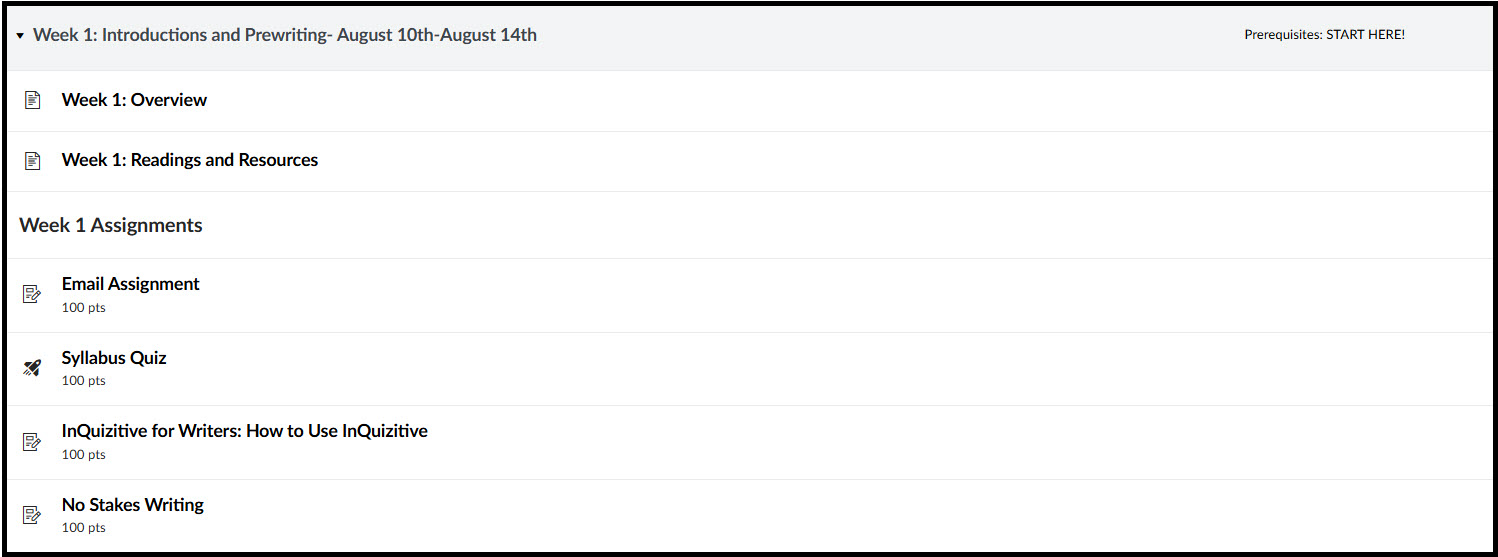
Your course should feel the same way. This is basically what Modules are for. Instead of making students dig through Pages, Assignments, Files, and Discussions separately, Modules line everything up in order: read this, watch this, do this, submit this.
Consistency matters more than people give it credit for. If every module follows roughly the same shape (overview, materials, practice, assignment), students stop having to worry about where things are and just focus on the actual content. That predictability is doing more work than you'd think.
If someone had never taken a class with you before, could they figure out where to go next without asking? You want your students to be on the right path and let the course itself guide them.
Every attraction needs a map
Show up at a theme park with no map and no signage, and even the best rides become a hassle to find. Your modules need the same thing: a map.
A quick overview at the top of each module does a lot of heavy lifting. What are they about to learn? What will they be able to do by the end? Two or three sentences is enough to connect the dots between "here's an activity" and "here's why it matters." Clear headings and instructions do the rest. They're the signposts that keep students confident they're headed the right way.
Think of each module as its own little trip: a clear start, a clear path through, and a clear sense of what "done" looks like. When that's clear up front, they can actually enjoy getting into the material instead of wondering if they're missing something.
Don't make students wait in line
Nobody likes standing in line more than they like the ride itself. Theme parks work hard to cut down on wasted time, and your course can too.
Every extra click, every menu item nobody uses, every buried resource or dead link. It's friction. Individually, small stuff. Over a whole semester, it adds up, and it's exhausting for students in a way they can't always name.
Hide the navigation links that aren’t needed or used: Files, Collaborations, maybe even Assignments and Quizzes if everything routes through Modules anyway. Take time to look through the navigation menu to really make sure that what is needed is there and everything else is hidden (Make sure that you hit that Save button when you update the Navigation!). Make instructions easy to find. Don't link the same thing five different ways. Try to skip the generic labels like "Week 3"; instead, give a more descriptive title. The less energy students spend hunting for things, the more they have left for learning the material.
Behind-the-scenes maintenance
Nobody notices the maintenance crew that shows up before the park opens, fixing signs, cleaning walkways, checking the rides. But that's exactly why the day feels seamless. (Fun fact: Disney World makes sure you're never more than 30 feet from a trash can. That's the max distance they found people would actually carry their trash before dropping it somewhere else.)
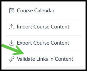
Your course needs that same quiet upkeep. Before the semester kicks off, walk through it with fresh eyes. Fix the due dates, click every link, reread your assignment instructions, update the homepage, run through it in Student View, and delete extra or unneeded materials. Don't overlook using the Validate Links in Content under Settings to help you find some of these issues. It's not glamorous going through all the small things, but it saves you many emails later.
You don't have to rebuild the whole course every term. Small, consistent tweaks are what keep it feeling polished. Just keeping things tidy goes further than people expect.
One last walk-through before the gates open
Before the semester starts, take one more lap through your course like you're a first-time visitor. Is the path clear? Are the signs doing their job? Is it obvious where to go next?
Mindful course design works a lot like good park design. When it's done right, nobody thinks about it. Students aren't stuck puzzling over navigation; they're just in it, learning and enjoying the ride. And like any great day at the park, that's the kind of class they'll actually remember.
If you need help or have questions while you are working on designing your course, please reach out to us at canvashelp@durhamtech.edu